> ## Documentation Index
> Fetch the complete documentation index at: https://subframe-59800133-apg-edit-updates.mintlify.site/llms.txt
> Use this file to discover all available pages before exploring further.
# Customizing theme
> Define design tokens for colors, typography, borders, corners, and shadows.
Your theme defines design tokens for your project. Design tokens are reusable values for colors, typography, borders, corners, and shadows. Each project contains its own theme used to generate a custom Tailwind CSS configuration.
## Navigating the theme page
Open **Theme** under **Design System** in the left sidebar, or press Cmd + K and search "Theme". Expand the **Theme** tab to jump to any section (Colors, Typography, Borders, Corners, Shadows).
A toolbar at the top of the theme page holds the main actions — **Ask AI**, **Import**, **Export** — plus a **⋯** menu with **Version history**, **Reset theme**, and **Add dark mode** / **Add light mode**. When dark mode is enabled, the menu shows **Remove dark mode** / **Remove light mode** instead. See [Dark mode](/guides/dark-mode) for details.
All changes save automatically and apply immediately across your project.
See also: [Importing tokens](/learn/theme/importing-tokens), [Exporting theme](/learn/theme/exporting-theme), [Adding custom fonts](/learn/theme/adding-custom-fonts)
## Finding token usage
Right-click any color, typography, border, corner, or shadow token and select **Find usage...** to see every design that references it. Search the list, click a design to preview it, then click **Go to component** to jump into the editor.
Check usage before renaming or deleting a token so you know what your changes will affect.
## Edit theme with Ask AI
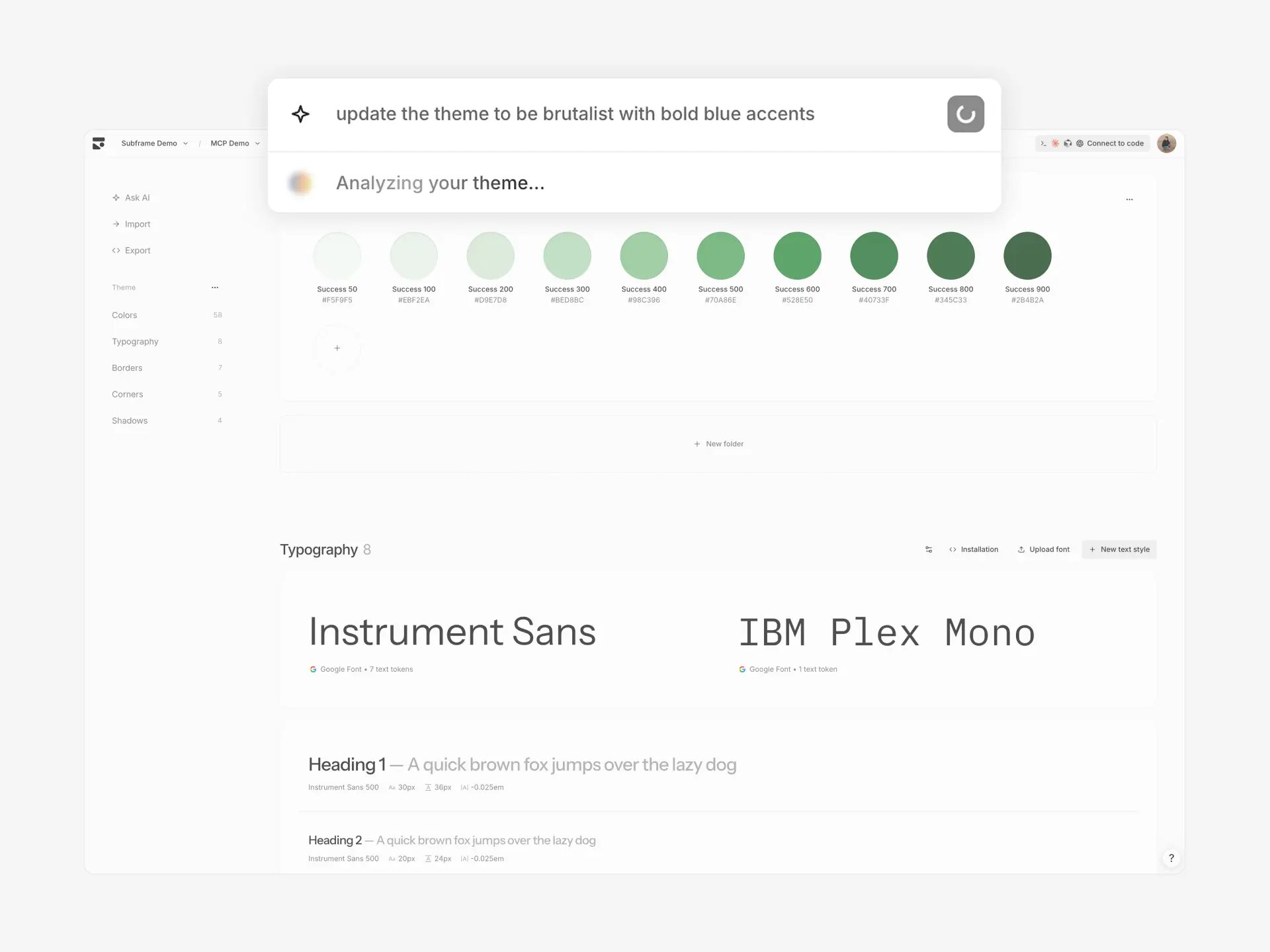 Use Ask AI to update your theme from a prompt:
1. Click **Ask AI** in the sidebar
2. Describe your changes: "warmer tones, rounder corners", "make it brutalist", or "retro theme with muted colors and bold typography"
3. Review the preview — AI updates colors, typography, corners, and shadows
4. Click **Apply** to update your theme
Ask AI can also rename or delete tokens when the changes call for it. All component references update automatically.
AI theme generation affects your entire project. Review the preview before applying.
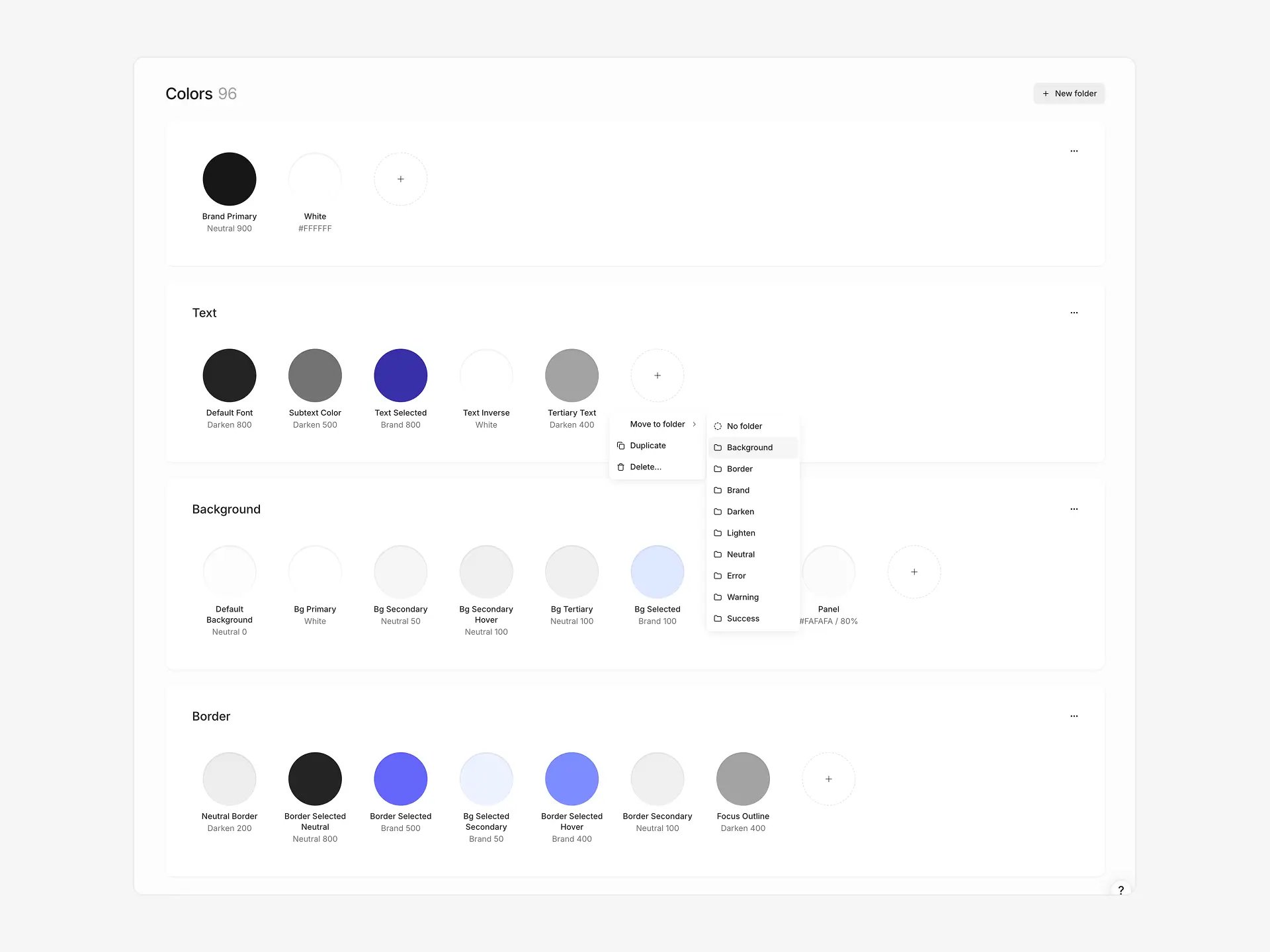
## Colors
Subframe organizes colors into **color tokens** grouped by **folders**.
Use Ask AI to update your theme from a prompt:
1. Click **Ask AI** in the sidebar
2. Describe your changes: "warmer tones, rounder corners", "make it brutalist", or "retro theme with muted colors and bold typography"
3. Review the preview — AI updates colors, typography, corners, and shadows
4. Click **Apply** to update your theme
Ask AI can also rename or delete tokens when the changes call for it. All component references update automatically.
AI theme generation affects your entire project. Review the preview before applying.
## Colors
Subframe organizes colors into **color tokens** grouped by **folders**.
 ```tsx theme={null}
Neutral background with default text color
```
**Color tokens** define individual colors for your design system. They can be used for specific UI purposes like Brand Primary, Default Background, or Neutral Border. Tokens can reference other tokens as aliases (e.g. Brand Primary → Brand 700).
**Folders** group related color tokens together. Organize tokens however you want — by brand, by feature, by shade scale, or any grouping that fits your system. A default **Colors** folder holds standalone tokens.
To quickly add tokens from an existing design system, see [Importing tokens](/learn/theme/importing-tokens).
### Creating color tokens and folders
**New color token:**
1. Click **New color** in any folder, or click the **+** button at the end of a folder's token row
2. Name your token descriptively: `accent-primary`, `surface-elevated`
3. Set color via picker or reference existing token
**New folder:**
1. Click **New folder** in the Colors section header
2. Rename your folder by clicking its name
3. Add tokens manually or via import
**Reordering:** Drag folders or tokens to reorder. Use the **...** menu on a folder to move it up or down.
Deleting a folder deletes all tokens inside it. Any component references to deleted tokens are detached.
### Editing color tokens
Click any token to open color picker. Set a direct color value or reference another token as an alias.
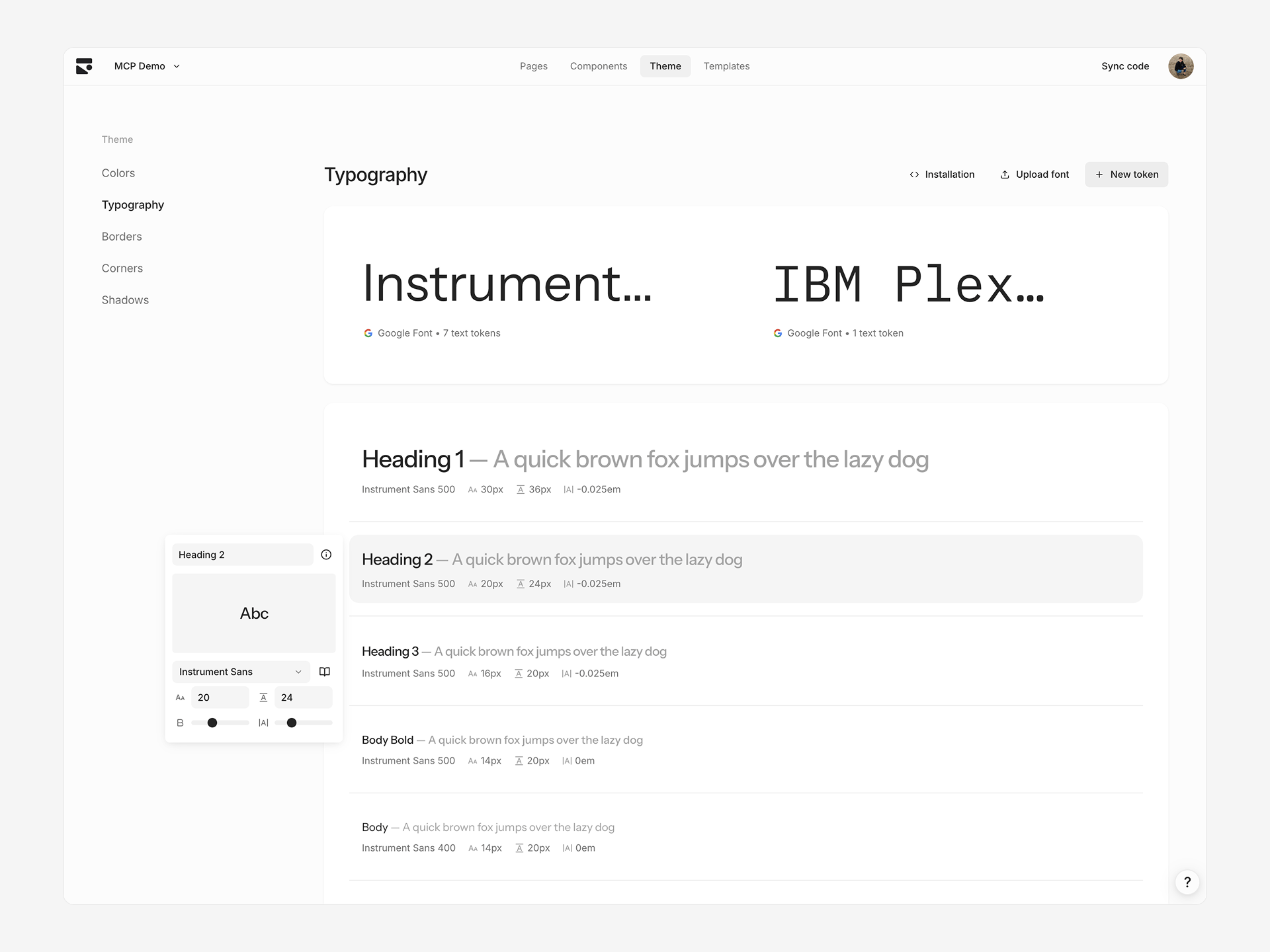
## Typography
Text tokens define typography styles with font family, size, weight, line height, and letter spacing.
 ```tsx theme={null}
Heading 1
```
### Creating text tokens
1. Click **+** in Typography section
2. Rename and adjust properties
New tokens duplicate the properties from the first token. Typography tokens auto-sort based on font size on the theme page.
### Editing text tokens
Click any text token to edit:
* **Font size** — Pixel value
* **Line height** — Pixel value
* **Font weight** — Slider based on font's supported weights
* **Letter spacing** — Slider from `-0.05em` to `0.05em`
### Changing font families
Click the font name card at the top to select a different font family. This updates all tokens using that font. Choose from a curated list of Google Fonts or custom uploaded fonts.
When dark mode is enabled, the font family card shows separate Light and Dark selectors so you can pair different fonts per mode.
### Adding custom fonts
Upgrade to the Pro plan to add custom fonts.
Upload WOFF, WOFF2, TTF, or OTF font files, with support for variable fonts.
For detailed upload steps and codebase installation, see [Adding custom fonts](/learn/theme/adding-custom-fonts).
## Borders
Border tokens define composite border styles consisting of color, width, and style.
```tsx theme={null}
Heading 1
```
### Creating text tokens
1. Click **+** in Typography section
2. Rename and adjust properties
New tokens duplicate the properties from the first token. Typography tokens auto-sort based on font size on the theme page.
### Editing text tokens
Click any text token to edit:
* **Font size** — Pixel value
* **Line height** — Pixel value
* **Font weight** — Slider based on font's supported weights
* **Letter spacing** — Slider from `-0.05em` to `0.05em`
### Changing font families
Click the font name card at the top to select a different font family. This updates all tokens using that font. Choose from a curated list of Google Fonts or custom uploaded fonts.
When dark mode is enabled, the font family card shows separate Light and Dark selectors so you can pair different fonts per mode.
### Adding custom fonts
Upgrade to the Pro plan to add custom fonts.
Upload WOFF, WOFF2, TTF, or OTF font files, with support for variable fonts.
For detailed upload steps and codebase installation, see [Adding custom fonts](/learn/theme/adding-custom-fonts).
## Borders
Border tokens define composite border styles consisting of color, width, and style.
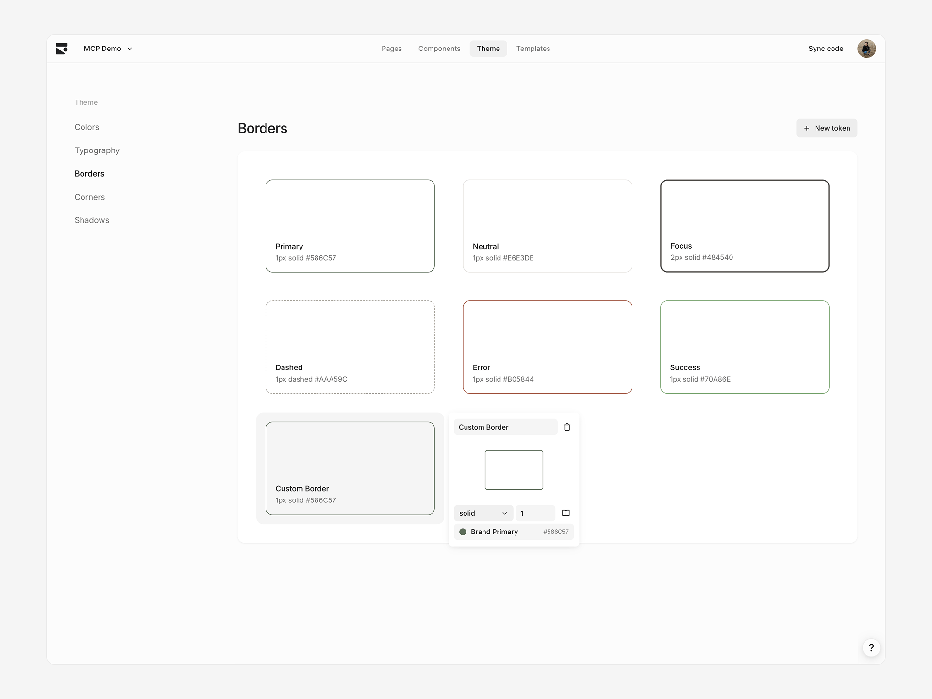 When generating code, border styles turn into explicit values for the border:
```tsx theme={null}
When generating code, border styles turn into explicit values for the border:
```tsx theme={null}
Border token: Primary Border Width: 1px Style: Solid Color: Brand Primary
```
### Creating border tokens
1. Click **+** in Borders section
2. Rename and adjust style, size, color
### Editing border tokens
Click any border token to edit:
* **Border style** — Solid or dashed
* **Border size** — Pixel width
* **Border color** — Color token reference or direct value
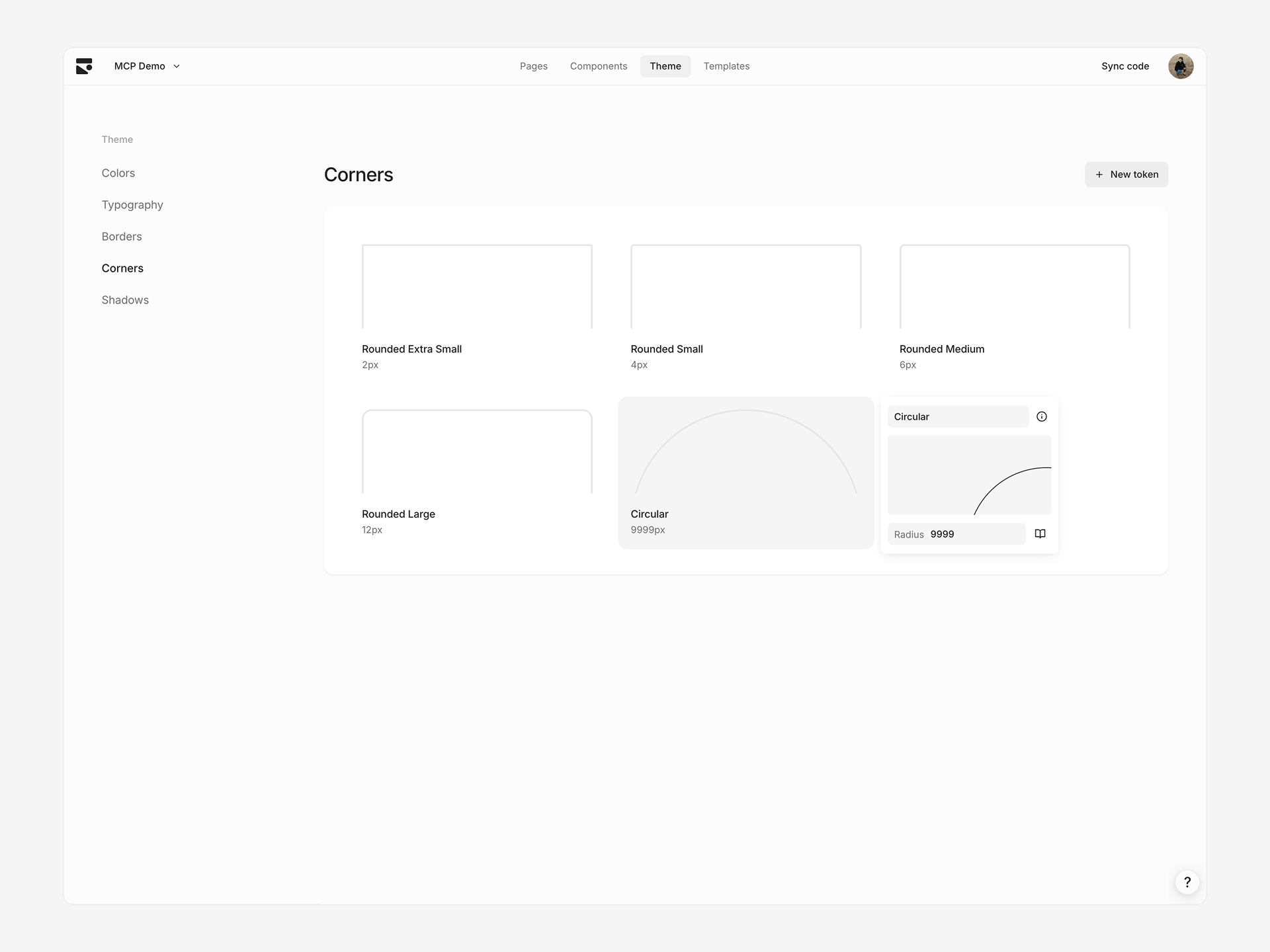
## Corners
Corner tokens define border radius values for consistent rounded corners.
 ```tsx theme={null}
Element with medium corner radius
```
### Creating corner tokens
1. Click **+** in Corners section
2. Set radius value
Corner tokens auto-sort based on value.
### Editing corner tokens
Click any corner token to edit radius value in pixels.
## Shadows
Shadow tokens define box shadows with multiple layers for depth and elevation.
 ```tsx theme={null}
Element with small shadow
```
### Creating shadow tokens
1. Click **+** in Shadows section
2. Add, remove, or edit shadow layers
Shadow tokens auto-sort based on perceived shadow effect.
### Editing shadow tokens
Click any shadow token to edit individual shadow layers. Each layer has:
* **Inset** — Whether shadow appears inside element
* **X/Y offset** — Horizontal and vertical offset in pixels
* **Blur radius** — Blur amount in pixels
* **Spread radius** — Spread amount in pixels
* **Color** — Shadow color with opacity
Add multiple layers for complex shadow effects.
## Theme presets
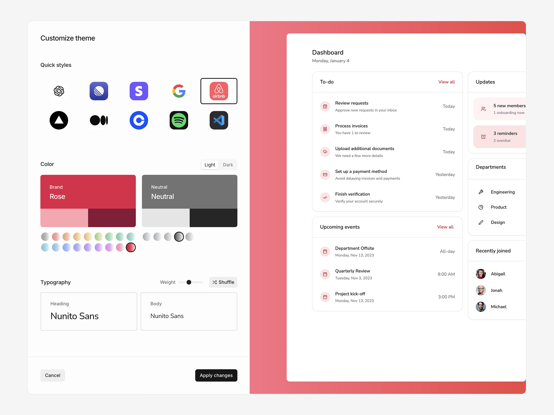 Apply a theme preset to start fresh:
1. Click **⋯** in the toolbar and select **Reset theme**
2. Browse 10 preset styles
3. Customize brand colors, fonts, and corner radius
4. Toggle between Light and Dark mode
Each preset configures color palettes (brand, neutral, error, success, warning), typography, and corner radius. Customize further after applying.
Applying a theme preset replaces values in your current theme.
## Version history
View and restore previous versions of your theme:
1. Click **⋯** in the toolbar and select **Version history**
2. Browse the timeline and select a version to preview
3. Click **Restore** to revert to that version
Select **Exit version history** from the same menu to return to editing.
## Limitations
**Spacing not configurable** — Spacing tokens (padding, gaps) use Tailwind defaults. Extend your Tailwind config manually for custom spacing in your codebase.
Apply a theme preset to start fresh:
1. Click **⋯** in the toolbar and select **Reset theme**
2. Browse 10 preset styles
3. Customize brand colors, fonts, and corner radius
4. Toggle between Light and Dark mode
Each preset configures color palettes (brand, neutral, error, success, warning), typography, and corner radius. Customize further after applying.
Applying a theme preset replaces values in your current theme.
## Version history
View and restore previous versions of your theme:
1. Click **⋯** in the toolbar and select **Version history**
2. Browse the timeline and select a version to preview
3. Click **Restore** to revert to that version
Select **Exit version history** from the same menu to return to editing.
## Limitations
**Spacing not configurable** — Spacing tokens (padding, gaps) use Tailwind defaults. Extend your Tailwind config manually for custom spacing in your codebase.