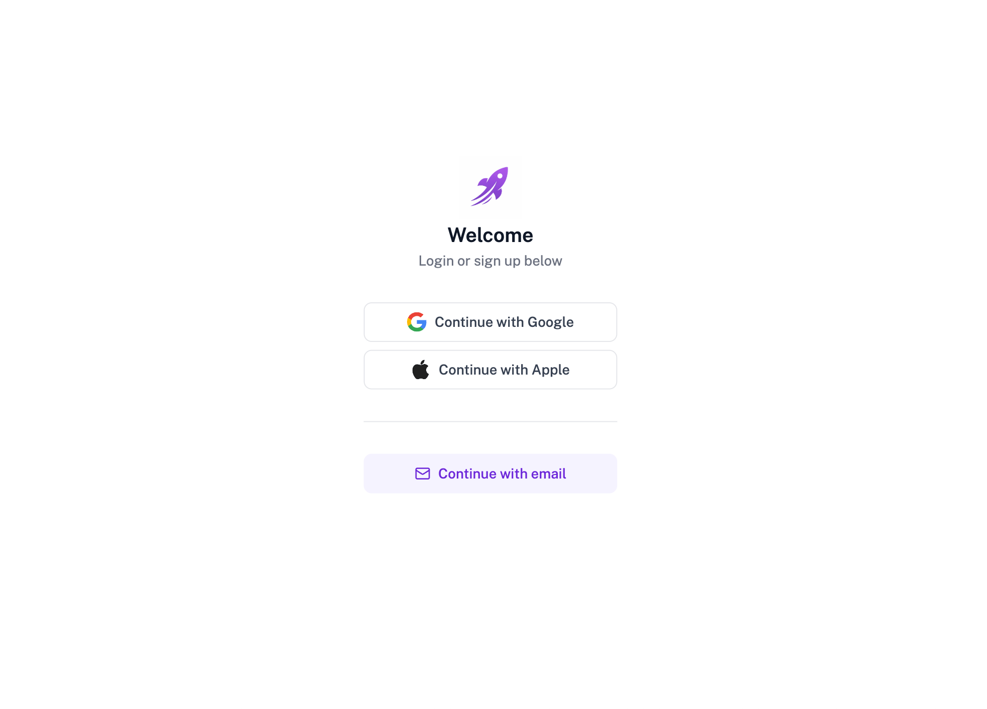
> ## Documentation Index
> Fetch the complete documentation index at: https://subframe-59800133-apg-edit-updates.mintlify.site/llms.txt
> Use this file to discover all available pages before exploring further.

# Design to code workflow

> How Subframe connects designs to your codebase.

Subframe is designed for building interfaces—the visual layer that designers own. Code generation in Subframe is **deterministic** and **purely presentational** (no API calls, state management, etc). Developers can later add application logic themselves using IDEs like Cursor or VS Code after export.

This guide explains Subframe's design-to-code workflow in detail.

#### Components vs pages

As a developer, you should treat **components** and **pages** differently:

* **Components** are your design system (e.g. buttons, inputs, cards). They are [synced via CLI](/concepts/syncing-components) to a folder in your codebase (default: `./ui/components`). Each component syncs as a directory — a source file that Subframe generates and you don't modify, plus a wrapper `index.tsx` that you can extend (see [Component directories](/upgrading/component-directories)).
* **Pages** are screens built from components. They are [exported](/concepts/exporting-pages) as copyable React code or using the MCP server and are meant to be modified after export.

In a nutshell, **components are synced, pages are exported**. This is because pages are typically modified with business logic like API calls after export. If your component needs logic after syncing, see our guide on best practices for [exporting components](/concepts/syncing-components).

## Design handoff

Suppose your designer creates a sign in page in Subframe:

<Frame>
  <img src="https://mintcdn.com/subframe-59800133-apg-edit-updates/h3QkDAiIDKnbbMvD/images/developers/signin-page-example.png?fit=max&auto=format&n=h3QkDAiIDKnbbMvD&q=85&s=458f9690d31efa3f5783f41788766ab2" alt="Sign in page designed in Subframe" width="1964" height="1412" data-path="images/developers/signin-page-example.png" />
</Frame>

When designers use Subframe, they are modifying the underlying code, which uses components that eventually live in your codebase. In this sign in page, the designer used the `Button` and `SocialSignInButton` components:
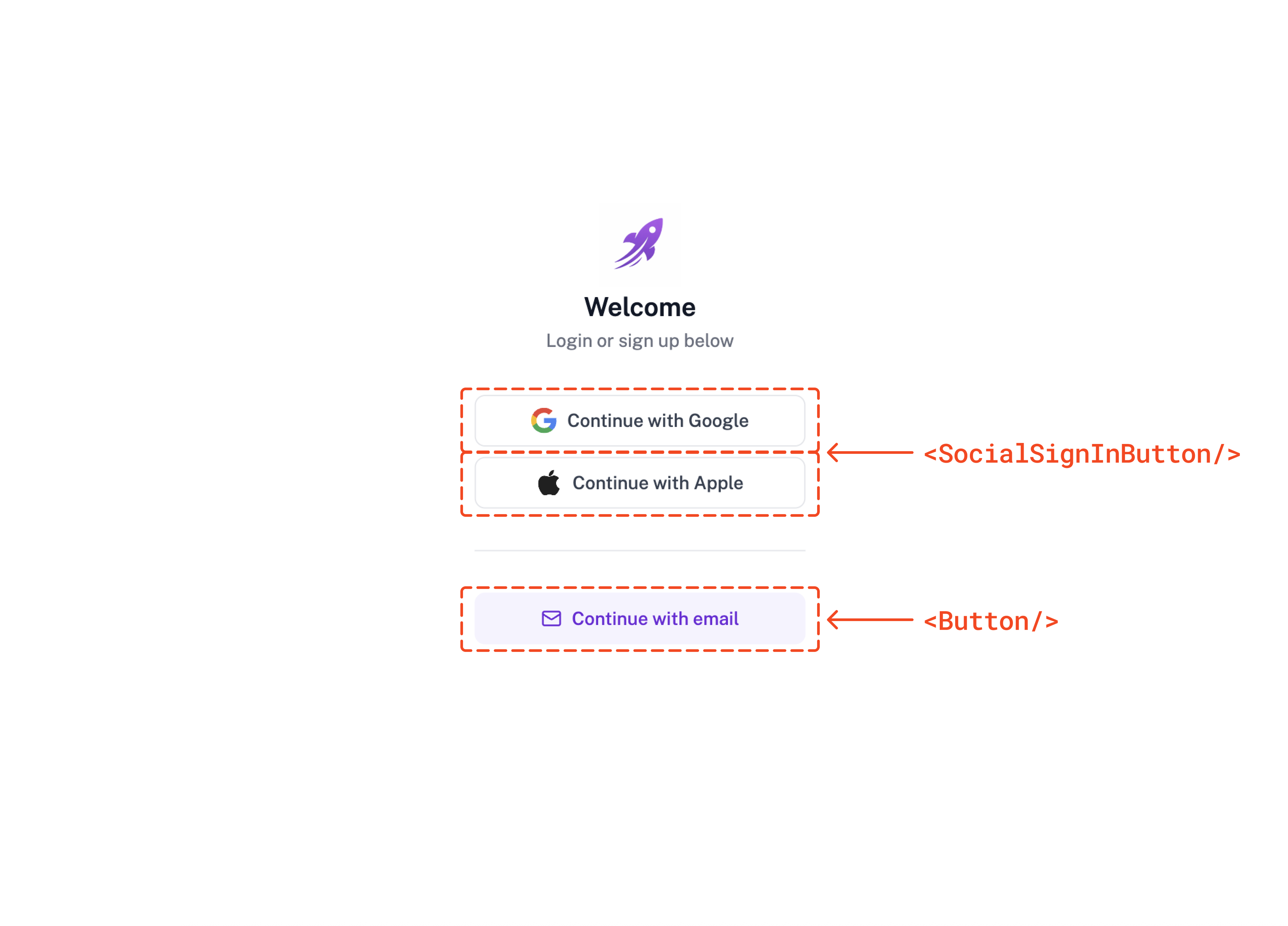
<Frame>
  <img src="https://mintcdn.com/subframe-59800133-apg-edit-updates/h3QkDAiIDKnbbMvD/images/developers/signin-page-example-annotated.png?fit=max&auto=format&n=h3QkDAiIDKnbbMvD&q=85&s=c4d3f18b926b0e477e11cec3e599f090" alt="Sign in page with components highlighted" width="3928" height="2824" data-path="images/developers/signin-page-example-annotated.png" />
</Frame>

### Syncing components

When the designs are ready for handoff, sync the `Button` and `SocialSignInButton` code to your codebase by running the following command:

<CodeGroup>
  ```bash npm theme={null}
  npx @subframe/cli@latest sync Button SocialSignInButton
  ```

  ```bash yarn theme={null}
  yarn dlx @subframe/cli@latest sync Button SocialSignInButton
  ```

  ```bash pnpm theme={null}
  pnpx @subframe/cli@latest sync Button SocialSignInButton
  ```

  ```bash bun theme={null}
  bunx @subframe/cli@latest sync Button SocialSignInButton
  ```
</CodeGroup>

You can also sync all design system components at once:

<CodeGroup>
  ```bash npm theme={null}
  npx @subframe/cli@latest sync --all
  ```

  ```bash yarn theme={null}
  yarn dlx @subframe/cli@latest sync --all
  ```

  ```bash pnpm theme={null}
  pnpx @subframe/cli@latest sync --all
  ```

  ```bash bun theme={null}
  bunx @subframe/cli@latest sync --all
  ```
</CodeGroup>

The CLI sync command pulls `Button`, `SocialSignInButton`, and any other components into a specific folder in your codebase. By default this folder is located in the `./src/ui/components` folder but can be configured in the [project settings](/learn/projects/project-settings).

```
src/ui/
└─ components/
// [!code ++:6]
  ├─ Button/
  │  ├─ Button.tsx
  │  └─ index.tsx
  └─ SocialSignInButton/
     ├─ SocialSignInButton.tsx
     └─ index.tsx
```

Each component syncs as a directory: the source file Subframe generates (`Button.tsx`) plus a wrapper `index.tsx` that re-exports it and is the import entrypoint. See [Component directories](/upgrading/component-directories) for why, and how to add your own logic in the wrapper.

<Accordion title="View synced code">
  <CodeGroup>
    ```tsx Button.tsx expandable theme={null}
    import React from "react"
    import * as SubframeCore from "@subframe/core"
    import * as SubframeUtils from "../utils"

    interface ButtonRootProps extends React.ButtonHTMLAttributes<HTMLButtonElement> {
      disabled?: boolean
      variant?: "brand-primary" | "brand-secondary" | "destructive-primary"
      size?: "large" | "medium" | "small"
      children?: React.ReactNode
      icon?: SubframeCore.IconName
      iconRight?: SubframeCore.IconName
      onClick?: (event: React.MouseEvent<HTMLButtonElement>) => void
      className?: string
    }

    const ButtonRoot = React.forwardRef<HTMLButtonElement, ButtonRootProps>(function ButtonRoot(
      {
        disabled = false,
        variant = "brand-primary",
        size = "medium",
        children,
        icon = null,
        iconRight = null,
        className,
        type = "button",
        ...otherProps
      }: ButtonRootProps,
      ref,
    ) {
      return (
        <button
          className={SubframeUtils.twClassNames(
            "group/3b777358 flex h-8 cursor-pointer items-center justify-center gap-2 rounded-md border-none bg-brand-600 px-3 text-left hover:bg-brand-500 active:bg-brand-600 disabled:cursor-default disabled:bg-neutral-200 hover:disabled:cursor-default hover:disabled:bg-neutral-200 active:disabled:cursor-default active:disabled:bg-neutral-200",
            {
              "h-6 w-auto flex-row flex-nowrap gap-1 px-2 py-0": size === "small",
              "h-10 w-auto px-4 py-0": size === "large",
              "bg-error-600 hover:bg-error-500 active:bg-error-600": variant === "destructive-primary",
              "bg-brand-50 hover:bg-brand-100 active:bg-brand-50": variant === "brand-secondary",
            },
            className,
          )}
          ref={ref}
          type={type}
          disabled={disabled}
          {...otherProps}
        >
          <SubframeCore.Icon
            className={SubframeUtils.twClassNames(
              "text-body font-body text-white group-disabled/3b777358:text-neutral-400",
              {
                "text-heading-3 font-heading-3": size === "large",
                "text-brand-700": variant === "brand-secondary",
              },
            )}
            name={icon}
          />
          <div
            className={SubframeUtils.twClassNames("hidden h-4 w-4 flex-none items-center justify-center gap-2", {
              "h-3 w-3 flex-none": size === "small",
            })}
          >
            <SubframeCore.Loader
              className={SubframeUtils.twClassNames(
                "font-['Inter'] text-[12px] font-[400] leading-[20px] text-white group-disabled/3b777358:text-neutral-400",
                {
                  "text-caption font-caption": size === "small",
                  "text-brand-700": variant === "brand-secondary",
                },
              )}
            />
          </div>
          {children ? (
            <span
              className={SubframeUtils.twClassNames(
                "whitespace-nowrap text-body-bold font-body-bold text-white group-disabled/3b777358:text-neutral-400",
                {
                  "text-caption-bold font-caption-bold": size === "small",
                  "text-brand-700": variant === "brand-secondary",
                },
              )}
            >
              {children}
            </span>
          ) : null}
          <SubframeCore.Icon
            className={SubframeUtils.twClassNames(
              "text-body font-body text-white group-disabled/3b777358:text-neutral-400",
              {
                "text-heading-3 font-heading-3": size === "large",
                "text-brand-700": variant === "brand-secondary",
              },
            )}
            name={iconRight}
          />
        </button>
      )
    })

    export const Button = ButtonRoot
    ```

    ```tsx SocialSignInButton.tsx expandable theme={null}
    import React from "react"
    import * as SubframeUtils from "../utils"

    interface SocialSignInButtonRootProps extends React.ButtonHTMLAttributes<HTMLButtonElement> {
      disabled?: boolean
      variant?: "facebook" | "google" | "apple"
      onClick?: (event: React.MouseEvent<HTMLButtonElement>) => void
      className?: string
    }

    const SocialSignInButtonRoot = React.forwardRef<HTMLButtonElement, SocialSignInButtonRootProps>(
      function SocialSignInButtonRoot(
        { disabled = false, variant = "facebook", className, type = "button", ...otherProps }: SocialSignInButtonRootProps,
        ref,
      ) {
        return (
          <button
            className={SubframeUtils.twClassNames(
              "group/f1948f75 flex h-10 w-full cursor-pointer items-center justify-center gap-2 rounded-md border border-solid border-neutral-border bg-white px-4 text-left hover:bg-neutral-50 active:bg-white disabled:cursor-default disabled:bg-white hover:disabled:cursor-default hover:disabled:bg-white active:disabled:cursor-default active:disabled:bg-white",
              className,
            )}
            ref={ref}
            type={type}
            disabled={disabled}
            {...otherProps}
          >
            <img
              className="h-5 w-5 flex-none object-cover"
              src={
                variant === "apple"
                  ? "https://res.cloudinary.com/subframe/image/upload/v1711417561/shared/kplo8lv2zjit3brqmadv.png"
                  : variant === "google"
                  ? "https://res.cloudinary.com/subframe/image/upload/v1711417516/shared/z0i3zyjjqkobzuaecgno.svg"
                  : "https://res.cloudinary.com/subframe/image/upload/v1711417550/shared/epocfym1zba2deri6krm.png"
              }
            />
            <span className="text-body-bold font-body-bold text-neutral-700 group-disabled/f1948f75:text-neutral-400">
              {variant === "apple"
                ? "Sign in with Apple"
                : variant === "google"
                ? "Sign in with Google"
                : "Sign in with Facebook"}
            </span>
          </button>
        )
      },
    )

    export const SocialSignInButton = SocialSignInButtonRoot
    ```
  </CodeGroup>
</Accordion>

For more information on syncing components, see the [Syncing components](/concepts/syncing-components) guide.

### Exporting pages

Subframe generates page code with stubs for business logic that need to be filled in:

```tsx SignInPage.tsx expandable theme={null}
import React from "react"
import { Button } from "@/ui/components/Button"
import { SocialSignInButton } from "@/ui/components/SocialSignInButton"

function SignInPage() {
  return (
    <div className="flex h-full w-full flex-col items-center justify-center bg-white">
      <div className="flex w-64 flex-col items-center justify-center gap-8">
        <div className="flex flex-col items-center justify-center gap-1">
          <img
            className="h-16 flex-none object-cover"
            src="https://res.cloudinary.com/subframe/image/upload/v1767591134/uploads/302/zzfsz5tcwky0pkjkru9d.png"
          />
          <span className="text-heading-2 font-heading-2 text-default-font">Welcome</span>
          <span className="text-body font-body text-subtext-color">Login or sign up below</span>
        </div>
        <div className="flex w-full flex-col items-center gap-2">
          <SocialSignInButton
            variant="google"
            onClick={(event: React.MouseEvent<HTMLButtonElement>) => {
              // [!code highlight:1]
              // TODO: Implement Google sign in
            }}
          />
          <SocialSignInButton
            variant="apple"
            onClick={(event: React.MouseEvent<HTMLButtonElement>) => {
              // [!code highlight:1]
              // TODO: Implement Apple sign in
            }}
          />
        </div>
        <div className="flex h-px w-full flex-none flex-col items-center gap-2 bg-neutral-border" />
        <Button
          className="h-10 w-full flex-none"
          variant="brand-secondary"
          size="large"
          icon="FeatherMail"
          onClick={(event: React.MouseEvent<HTMLButtonElement>) => {
            // [!code highlight:1]
            // TODO: Implement email sign in
          }}
        >
          Continue with email
        </Button>
      </div>
    </div>
  )
}

export default SignInPage
```

The page code can be exported in two ways:

* **MCP server (recommended)** - install Subframe MCP server and ask your AI tool to integrate the page code directly using the [page link](/guides/mcp-server#using-the-mcp-server).
* **Copy/paste** - Open **Code** > **Inspect** in Subframe and copy the React code.

We recommend using the MCP server because you can also ask AI to add business logic or update the page code based on code changes. Once exported, refactor the code or add any business logic as needed.

```tsx SignInPage.tsx expandable theme={null}
import React from "react"
import { Button } from "@/ui/components/Button"
import { SocialSignInButton } from "@/ui/components/SocialSignInButton"
// [!code ++:2]
import { useNavigate } from "react-router-dom"
import { signInWithGoogle, signInWithApple } from "@/lib/auth"

function SignInPage() {
  // [!code ++:1]
  const navigate = useNavigate()

  return (
    <div className="flex h-full w-full flex-col items-center justify-center bg-white">
      <div className="flex w-64 flex-col items-center justify-center gap-8">
        <div className="flex flex-col items-center justify-center gap-1">
          <img
            className="h-16 flex-none object-cover"
            src="https://res.cloudinary.com/subframe/image/upload/v1767591134/uploads/302/zzfsz5tcwky0pkjkru9d.png"
          />
          <span className="text-heading-2 font-heading-2 text-default-font">Welcome</span>
          <span className="text-body font-body text-subtext-color">Login or sign up below</span>
        </div>
        <div className="flex w-full flex-col items-center gap-2">
          <SocialSignInButton
            variant="google"
            // [!code ++:4]
            onClick={async () => {
              await signInWithGoogle()
              navigate("/dashboard")
            }}
          />
          <SocialSignInButton
            variant="apple"
            // [!code ++:4]
            onClick={async () => {
              await signInWithApple()
              navigate("/dashboard")
            }}
          />
        </div>
        <div className="flex h-px w-full flex-none flex-col items-center gap-2 bg-neutral-border" />
        <Button
          className="h-10 w-full flex-none"
          variant="brand-secondary"
          size="large"
          icon="FeatherMail"
          // [!code ++:3]
          onClick={() => {
            navigate("/sign-in/email")
          }}
        >
          Continue with email
        </Button>
      </div>
    </div>
  )
}

export default SignInPage
```

## Iterating on designs

After the initial export, both designs and code will evolve. Here's how to handle changes:

### Designer makes changes

Subframe lets designers own the visual layer. When a change is made in Subframe, you can re-export the diff into your codebase.

**Component updates**

Run the sync command to get the latest component code:

<CodeGroup>
  ```bash npm theme={null}
  npx @subframe/cli@latest sync --all
  ```

  ```bash yarn theme={null}
  yarn dlx @subframe/cli@latest sync --all
  ```

  ```bash pnpm theme={null}
  pnpx @subframe/cli@latest sync --all
  ```

  ```bash bun theme={null}
  bunx @subframe/cli@latest sync --all
  ```
</CodeGroup>

If a component has breaking changes, TypeScript will throw errors wherever that component is used. This makes it easy for developers to find and update the affected code.

**Page updates**

The recommended way is to prompt your AI tool using the MCP server to update the page code:

```text theme={null}
Update the existing page to match the Subframe design at
https://app.subframe.com/<YOUR_PROJECT_ID>/design/<DESIGN_ID>/edit.

Preserve all existing functionality unless the new design requires a change.
```

AI will fetch the latest design and merge it with your existing code, preserving your business logic.

### Developer makes changes

Often times, you will need to add or modify the component behavior after handoff.

The best practice is to add your logic to the component's [wrapper `index.tsx`](/concepts/syncing-components#wrapping-components). You probably don't need to sync code back to Subframe, since the source file that Subframe generates stays untouched and keeps receiving design updates. As a last resort, you can [disable sync](/concepts/syncing-components#disabling-sync) for the source file itself.

In the near future, we will add CLI commands to sync component code back to Subframe. If you are interested in this feature, please let us know by [joining our Slack community](https://join.slack.com/t/subframecommunity/shared_invite/zt-380uma6dv-_lr7_bDLU5DJcoygfUYkeQ).

To import an existing page code back to Subframe, you can take a screenshot of the page and ask Subframe AI to recreate the design in Subframe.

## Beyond handoff

Once a feature ships, page designs may drift from code. That's okay — page designs are artifacts for communication. Once the feature is live, the code is the source of truth.

Components are different. They stay synced, so Subframe remains the single source of truth for your design system. When a designer updates a button or input, you re-run sync and every page using that component gets the update.
